Statistics
Sales statistics
Thanks to the huge detail in the Getty Images royalty statements, we're able to provide very detailed lists and charts.
The 'Statistics' section in DeepMeta presents your sales data as an interactive set of widgets, where each can be used to filter the data, immediately affecting the other widgets.
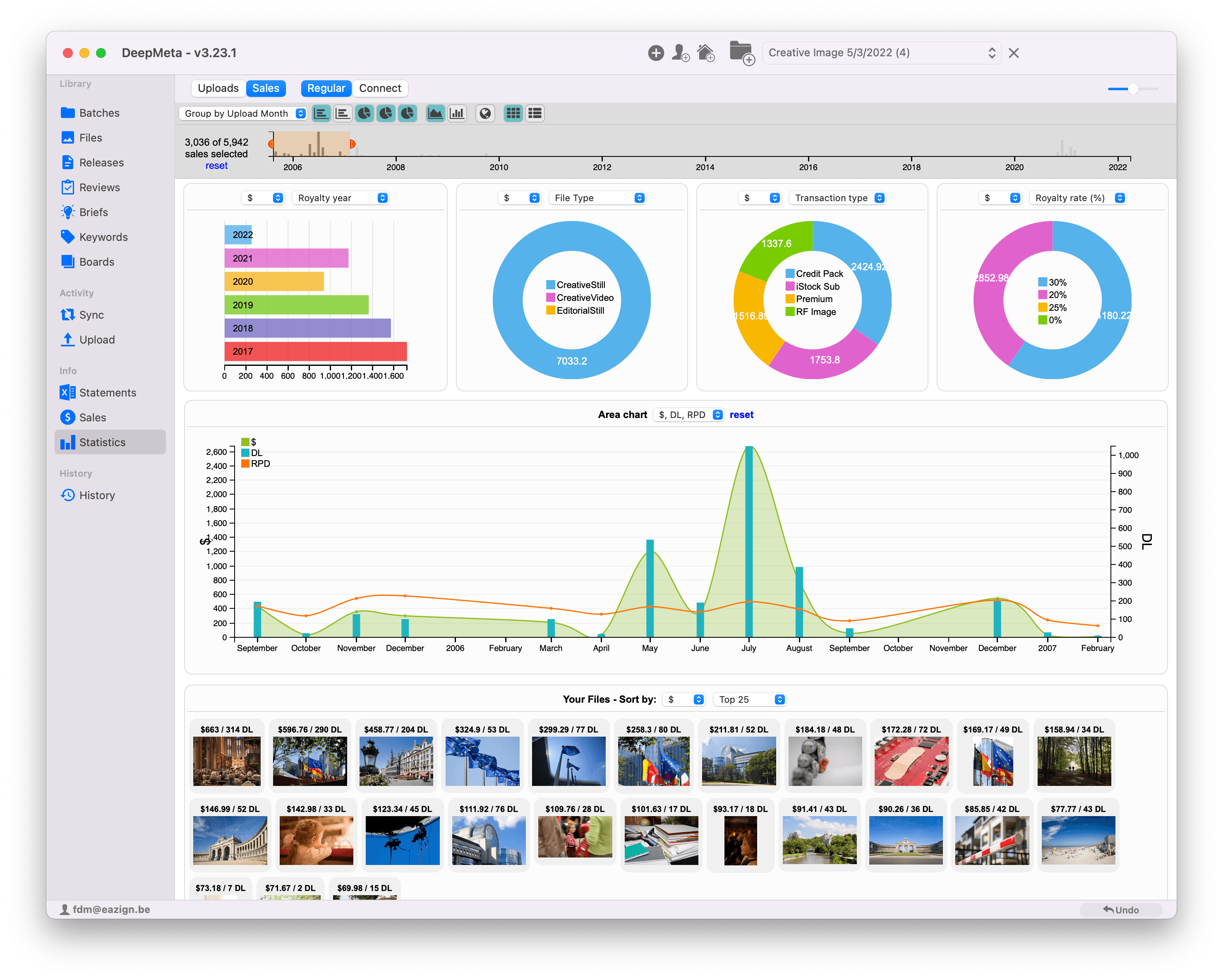
Select Statistics in the left hand meny and then the Sales tab at the top. You can enable Regular and/or Connect sales.
Once you've gotten used to the simple mechanics behind the widgets, you'll find this an invaluable and powerful tool for determining where to put your future efforts for maximum success. Let's go through the sections one by one, starting with the top control bar.
The control bar
This bar remains on top of the window, with all the charts widgets scrolling underneath.
-
Reset: Probably the most important link on the page. Click it to reset all filters you've made. In the above example, you see '214 of 214 sales selected' below the link. This means that all the widgets show data for ALL the sales that were downloaded. (See the Statements & Sales section for how to download sales data)
-
Pie charts, Bar chart, Area chart, World/US Map and Your Files hide or show the widgets of these types. We'll go through each type one by one below.
-
Bar chart: Shows the full timeline covered by your downloaded sales data. Each grey bar shows the number of downloads for that date
-
Grouping: This dropdown list allows selecting how to group the dates:
-
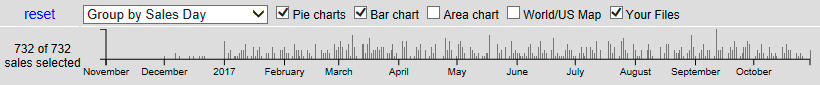
Group by Sales Day: Sales and Downloads shown on the timeline are grouped by the day of sale
-
Group by Sales Week: Sales and Downloads Grouped by the week of sale
-
Group by Sales Month: Sales and Downloads grouped by month of sale
-
Group by Statement Month: Sales and Downloads by the Royalty statement they occur in. In other words, when the sales were payed out.
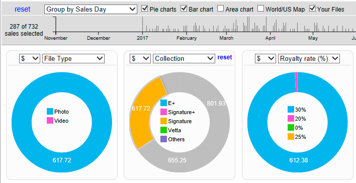
Here's how the timeline looks with Grouped by Sales Week selected:
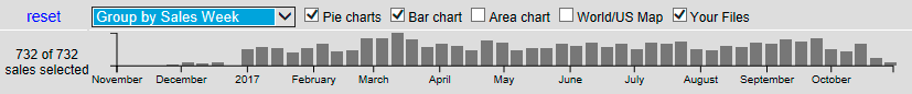
Note that now the set of sales records has changed to '55 of 214 selected'. All data shown on the Statistics page now applies to the 55 selected sales! This is where the 'reset' link comes in: click it to reset the shown data to all available sales.
Let's now go through the possible widget types showing your sales data ...
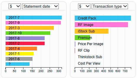
Pie charts
If the Pie charts checkbox in the top bar is selected, 2 or 3 Pie charts are shown, depending on the size of the DeepMeta window.
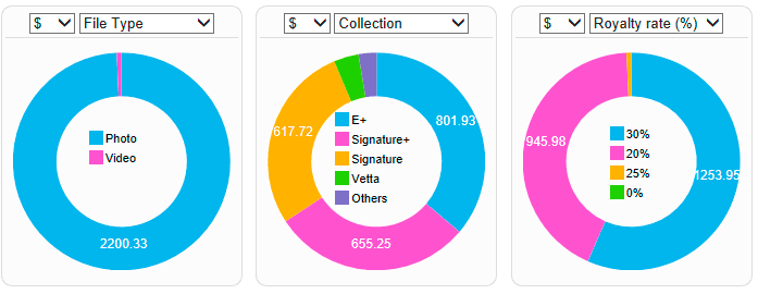
Hover with the mouse cursor over any of the pie slices to get a tooltip with details.
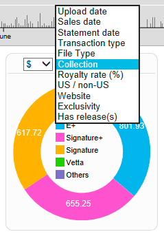
The charts will show whatever you want them to. Select either '$' (Gross royalties) or 'DL' (number of downloads) from the first dropdown list. Select the type of data to show in the second one:
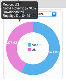
Now click the pink 'US' slice to select it. What happens is that now the entire Statistics page data is filtered to only show US sales. Notice that now "73 of 214 sales selected" is shown at the top bar. The other Pie charts also immediately reflect the new filtered data.
Click additional slices in the same pie chart to filter on multiple slices.
Notice there is now a blue 'reset' link in the Pie chart heading. Click it to clear the filtering caused by this pie's selection.
Alternatively, click the 'reset' link in the top bar to clear all filters across the entire Statistics page.
Just play around a bit, selecting various slices, using the 'reset' links to get things back to 'normal'.
We'll be able to use the same concept throughout the Statistics page. Remember that filtering on any of the widgets immediately reflects all other widgets on the page, just like selecting a time range on the top bar affects all widgets as well.
Row charts
The 'Pie Chart' section also shows 2 variations in the shape of 'Row charts'. Just another way to show royalties and downloads. Some type if data is more suited to Pie charts, some to Row charts. The choice is yours.
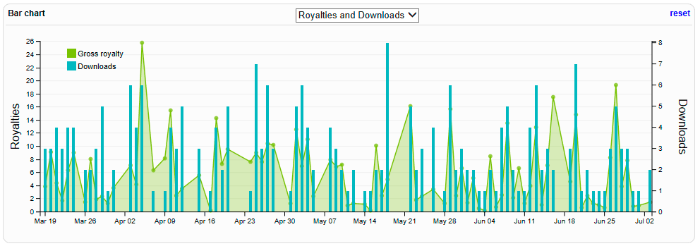
The Bar chart
The Bar chart currently has just one type selection: it shows your 'Royalties & Downloads' over time. The default time range covers the entire rang of all your Royalty statements, but as seen above, we can limit this by dragging a zone in the Control bar timeline at the top of the Statistics page. Downloads are shown as blue bars, royalties as a green area. Hover over the bars and dots for details.
The Area chart
The Area chart shows the evolution of certain aspects of your sales over time. Here's an example of sales of different collections (Signature, E+, ...) over the last few months. As shown, this range was selected on the Control bar timeline (orange zone), with grouping per week.
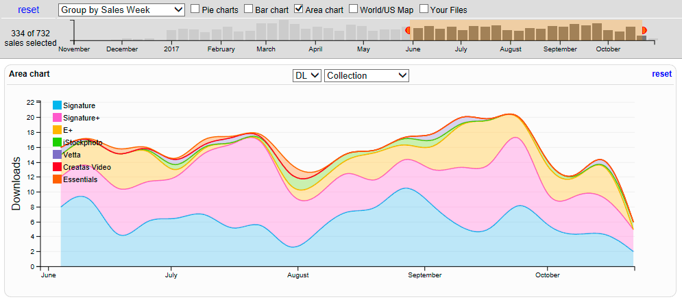
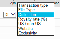
As with the Pie and Row charts, we can choose what dimensions to show in the chart, by means of the dropdown list:
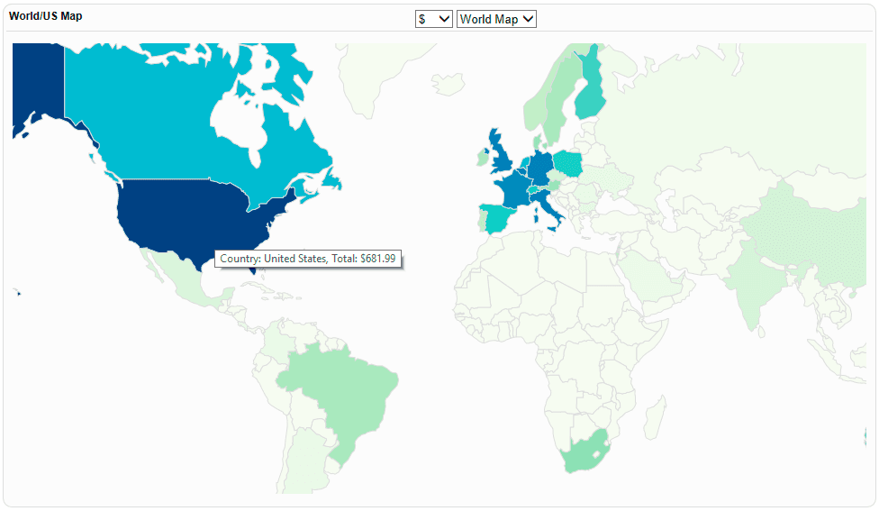
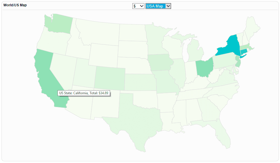
The World/US map
To see how well your files do in a certain country, you can use one of the Row charts, as shown above, but most informative are the dedicated World and US maps:
Your files
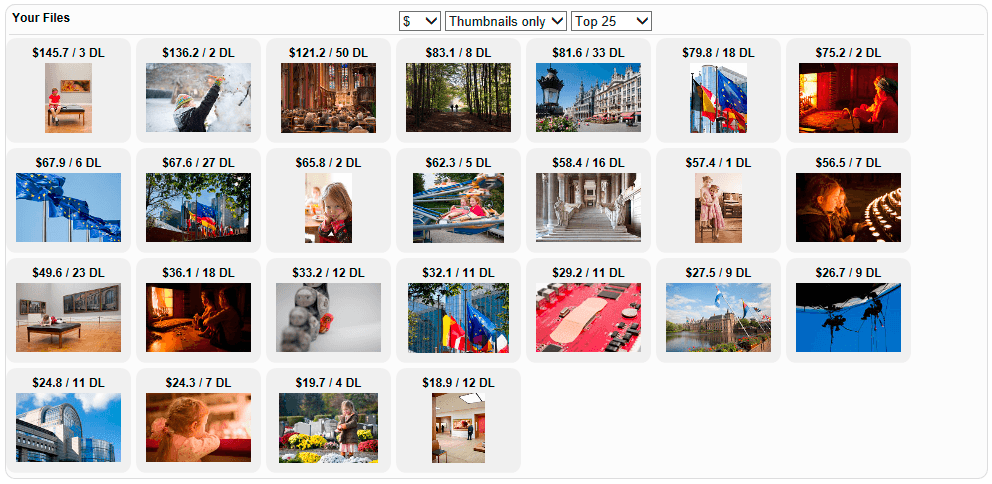
We've kept the most important widget for the end. Finding out where and under what collection your files sell, is all interesting and informative, but in the end, you'll mostly want to find out which of your files sell well. This can be a great indicator for deciding what to shoot next and where to invest for future shoots or projects.
The most compact file view is 'Thumbnails only', showing a grid of your top 25/50/100/250 sellers, sorted by royalty or downloads. Each thumbnail shows the royalty and download count:
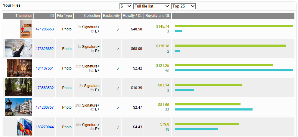
Most informative is the 'Full File list' view:
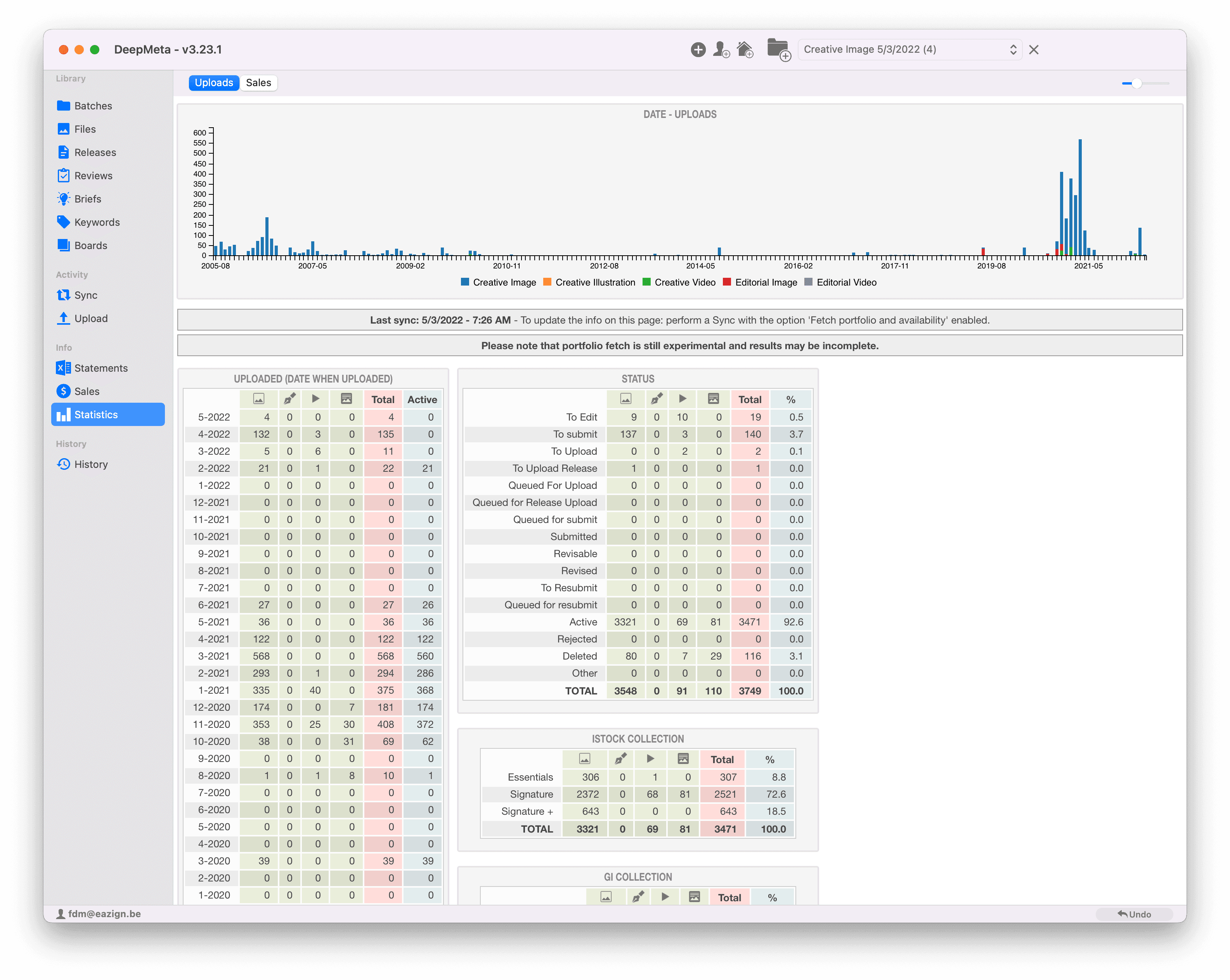
Upload statistics
Select the Uploads tab at the top of the Statistics section to get an overview on your upload data: